Life, Technology, and Meteorology

Category: Gaucho Software (Page 6 of 8)

Complete Satellite Image

Version 1.2 of Seasonality will include a new web export feature, so users can export data from Seasonality to a web page via templates. One thing I want to give users the option of doing is generating a full earth satellite image. This takes about 30 seconds to generate on my G5, so I expect that not everyone will want to enable it, but it’s available. Here’s one such image that I just generated a few minutes ago…


2005-11-05 5:20 am GMT, click to view full size.

To give you an idea, the full size image linked is still just 1/20th of the resolution available along each axis at 100% in Seasonality (1/400 of the total res). Ever since getting into collecting this weather and terrain data, I’m just totally amazed by it. In fact, a few weeks ago I just downloaded the second set of terrain imagery put out by the Blue Marble project, all 24Gb of it. It’s a set of 12 (1 for each month of the year) images, each with a res of 86400×43200 pixels. I’m not sure what I’ll do with it yet, but look for some kind of application of this imagery in a future version of Seasonality.

Software Updates

A few software updates have been released today. First off, I posted Seasonality 1.1.1 this morning. This is a bug fix release with quite a few changes from version 1.1. Check out the changelog here and download it here. Next up is version 1.2 and development is already in progress.

The bigger update is actually some consulting work that I have been doing. As of a few months ago, DynDNS now supports an official Mac client (DynDNS Updater) for users of their DNS services. I have been maintaining the code and adding new features since this past May when we forked Julien Jalon’s DNSUpdate code. DynDNS Updater 1.2 was released today and includes a new Dashboard widget and a few bug fixes. I think the widget came out pretty nice, and I had a great time working on it with Jeremy and Chris over at DynDNS. Congrats on the release.

Surf-Bits Seasonality Review

Surf-Bits posted an excellent review of Seasonality over on their site…

What I liked most about Seasonality was it’s ease of use and flexibility. It was extremely easy for me to setup multiple monitoring locations so I could at a glance see what the weather happened to be like in London while I was chatting on the phone with a client in England.

Wilma

In case you haven’t heard, Hurricane Wilma is brewing out off the coast of the Yucatan Peninsula right now. Wilma is the strongest hurricane ever measured in the Atlantic ocean, when a hurricane hunter aircraft measured a central air pressure of just 882mb a few days ago, 6 millibars lower than the previous record. The hurricane has “weakened” since then and has now settled down to a Category 4 hurricane with 150 mph winds, but that’s still pretty strong. It’s heading directly towards Cozumel and Cancun at the moment. I would hate to see that area destroyed…Katrina and I went on a cruise that stopped at Cozumel for our honeymoon. It was a great little town and we had a lot of fun both there and in Playa del Carmen.


Hurricane Wilma, October 20 6pm EDT

Meteorologists really aren’t sure where it’s gonna go from here, but it looks like it will sweep across Florida before heading North off the east coast…

So what’s next? Well, after getting to the letter W for yearly storm names, Greek letters are used. The next storm will be alpha, beta, etc… It’s rare to get this far in the alphabet, and there are still several weeks left of hurricane season. This year is definitely one for the record books.

Seasonality 1.1 Released

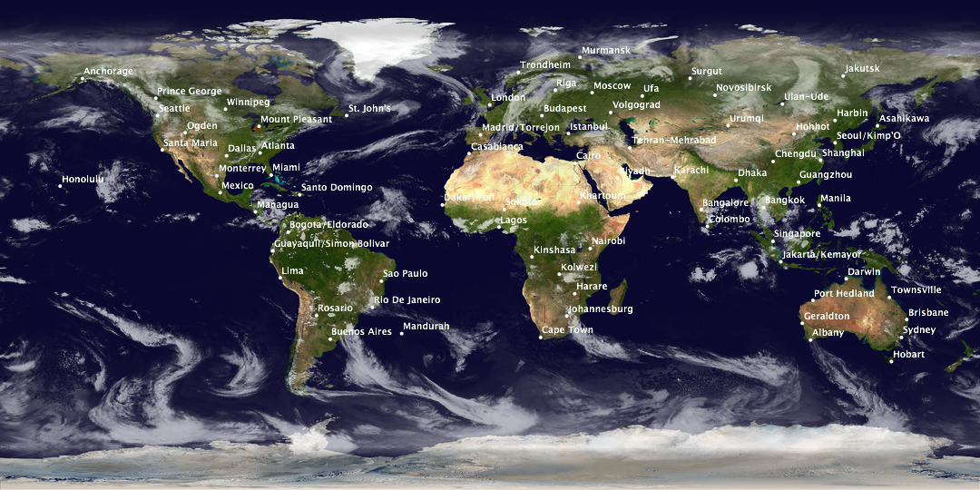
Today’s a day to bust out the champagne and celebrate, Seasonality 1.1 is finally ready and has been released. If you’ve been reading here, you already know the biggest new feature is international location support. This version supports 34,000 locations in 202 countries. I’m really glad to be able to support global users. I wanted to add international support for version 1.0, but time constraints kept me from doing it.

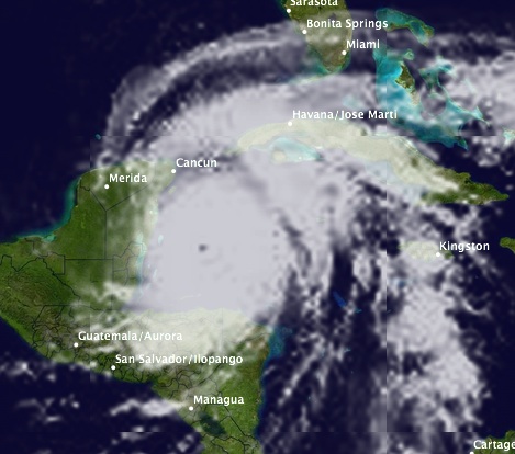
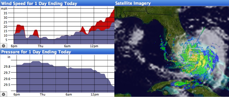
You’ve also seen pictures of the new satellite images, but one thing that I haven’t posted about is the new cylindrical wind direction graph. The idea for this graph came up one evening while Katrina and I were brainstorming about how to best display wind direction on a graph. Typical weather programs will show something like the first graph below with the direction along the y axis and time along the x axis. The problem is when you look at time periods like the end of the graph below. Really, the wind direction didn’t change much from Friday to Saturday, but the graph is bouncing all over the place. Sure, I could have just found a way to wrap the graph from top to bottom, but there are a lot of different cases that need to be handled, and not all of them can be handled in an elegant way.

So when we were talking about this problem, we figured that really the problem was that you can’t map the directions of a compass onto a mathematical plane, because 360 and 0 are the same direction so the graph would have to be “broken” somewhere. The solution we came up with was to map the data onto a cylinder. This way it’s easy to display 360 and 0 degrees as the same value. In the second graph below, you can see that between Friday and Saturday the wind direction was hovering around NNE, and the curve isn’t bouncing so much, making it easier to read. The rest of the graph is shown on the back of the cylinder, but I let people spin it around so they can see any part of the graph in more detail. Spinning the graph is a real trip, just seeing the other side of the graph roll around the bottom or top is pretty cool.

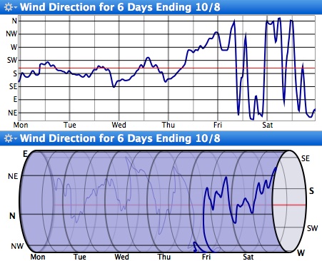
We’ll see if users end up loving or hating it. I ended up including both graphs in the final version just in case some people prefer the standard graph method.

So if you haven’t already, check out Seasonality 1.1. And even though there are a ton of new features in this version, this is just the beginning, I already got a set of features lined up for 1.2.

Oh sweet data…

One thing I never expected when starting work on Seasonality is the shear amount of weather data that is available on the web. Sometimes it’s hard to get a handle on all the information. I have a weather database served by PostgreSQL, and that’s starting to take several GB on my server. Well, last night I was browsing for a METAR station name listing (the station names I currently have are truncated to around 15 characters), and I came across an NOAA FTP server that allows users to download raw METAR observations for all the sites around the globe. This is the same data I use to draw the graph in Seasonality, so I had to check it out…

Sure enough, even though the file format is kind of messy, I was able to write a download/parsing script to access the data and insert it into my database. The dataset is just huge…after only 12 hours I’ve collected somewhere in the order of 100,000 records. It’s almost too much data for my lowly database server to handle, originally taking about 75% of the time to actually parse the data that was generated in a given time span. I eventually optimized it a bit, so it will fetch data every 2 hours and take maybe a half hour to do the parsing.

So what am I going to do with this data? Well, there’s a ton of possibilities, but the best one I can think of is to offer a method for new Seasonality users to “download the last month/3 months of graph data.” This way users won’t have to wait so long to get a good range of graph data. We’ll have to see how this goes though. Obviously there are bandwidth and storage issues involved, and I’m sure that once the database gets beyond a certain size, scalability will be an issue as well.

Another cool database I found about a month ago was the GEOnet Names Server (GNS). This is a database of around 5 million different cities and geographic features worldwide. I ended up importing this data into Postgres as well, though I had to transfer the database to my G5 to execute queries in any reasonable amount of time. After creating several indexes on the table and giving the database 1.5Gb of RAM (enough to store the full table in), I got a typical select down to around 10 seconds for a full table scan based on indexed columns. It’s actually faster locally then using their web server to do a query…then again I’m the only user hitting it over here. πŸ™‚ This data source helped a lot when I was trying to find longitude/latitude pairs for the new global locations in the upcoming version.

Hurricane Katrina donation

A couple of weeks ago, when I first mentioned Hurricane Katrina, it was barely a category 1 storm touching the southern tip of Florida. It is amazing to me that the storm grew so much as to become a category 4/5 hurricane, and my heart goes out to all the people who were affected by the storm.

Since the primary Gaucho Software product is a weather application, it only seems appropriate for the company to help in a time like this, so Gaucho Software will donate 25% of all sales during the month of September to the American Red Cross. As many people know, the Red Cross is pretty much at the forefront of the hurricane relief efforts, and I can’t think of a better organization to make a donation to.

I would also like to encourage others to make donations if they haven’t already. It sounds like many Americans (and others worldwide) are already banding together to help, which is great, but there’s still a lot of work that needs to be done.

Hurricane Katrina

In case you haven’t heard, hurricane Katrina will be hitting Florida during the next several hours. It’s pretty cool that they used Katrina’s name, since it’s not too common of a name to begin with. Anyway, thought I would take the opportunity to post another snapshot of Seasonality 1.1, this one is from Fort Lauderdale, FL:

Though completely new for this version, I’ve posted about the new satellite imagery a few times previously so I won’t talk about that here (that’s one heck of a storm though!). However, in this shot you can also see some new features in the graph views. For one, there are two new graph types, a Pressure Graph and Wind Direction Graph (I haven’t quite finished this one yet). Also, each graph now has a gear menu where you can choose which graph to display. Originally I thought I would just let people choose what the secondary graph would be, but in the end figured it wasn’t difficult to let people specify which dataset to display for both of them.

The list of new features for version 1.1 is pretty incredible. I’ve had more check-ins to the code repository than I can count, and as of right now I’ve added about 6000 lines of code since the last release (not including a lot of code refactoring). Furthermore, there are many areas where I was able to improve performance (sometimes 2 or 3x). It should be a pretty cool release, and hopefully sales will reflect that afterwards. πŸ™‚

« Older posts Newer posts »

© 2026 *Coder Blog

Theme by Anders NorenUp ↑