Life, Technology, and Meteorology

Author: mike (Page 8 of 26)

90 Meter Elevation Data

To generate an international forecast for Seasonality, I take in a GeoPoint and find the 4 closest surrounding data points from the GFS Forecast model. The GFS data is 0.5 degree resolution, so if I had a location at point 50.2° latitude, 30.8° longitude, I would use the following data points when generating the forecast: (50°, 30.5°), (50°, 31°), (50.5°, 30.5°), and (50.5°, 31°). The problem is that these surrounding points could be fairly distant from the weather location being queried, so depending on the terrain a forecast can vary widely. However, the forecast could be made more accurate if the elevations of each GeoPoint is taken into account.

So where does the 90 meter data come from? Well, the SRTM mission a few years back captured this level of detail for the area from -60° to 60° latitude, which includes almost all the land masses. Outside that range, a lower resolution dataset is used to fill in the gaps. A data point every 90 meters doesn’t sound like much; after all that’s elevation points about a football field away from each other. I imagine in some terrain where you have a lot of quick elevation changes, such as canyons or cliffs, this wouldn’t be enough. However, do not underestimate the amount of data here. The compressed download is around 1.2 gigabytes, and it expands to a ~7 gigabyte data file. The entire dataset is 86400×43200 data points, or 3,732,480,000 GeoPoints. Multiply that by 2 bytes per data point and you have a 7 gigabyte file.

Fortunately, this file is easy to parse. There is no header, just the raw data. The map projection is a simple equirectangular projection, giving equal distance across latitude and longitude. The location starts at (90°, -180°) and continues across an entire 86400 point row before moving South to the next row. The final GeoPoint is (-90°, 180°). Each data point is a signed “short” integer (2 bytes long). Perl’s unpack function works wonders here to get a short value from the binary data.This data is going to be perfect for taking elevation into account while forecasting. Its resolution is over 14000x (!) more detailed than my 0.5 degree GFS dataset, giving 120 GeoPoints between each GFS GeoPoint in each dimension. This should be plenty of data to work with. Maybe I’ll talk about how I use elevation to make more accurate forecasts in a future article.

Summer Update

It’s been almost two months since I’ve posted here, so to avoid the risk of this blog becoming a dinosaur, I thought I would post an update.

Katrina and I returned from our 6-7 week road trip in the beginning of July. We drove out to California at the end of May, and stayed with family for several weeks (also hitting WWDC, of course). On the way out there, we took the northern route, hitting Mt. Rushmore, Yellowstone, the Tetons, and the Salt Flats. On the way back, we started in Santa Monica and drove Route 66 all the way through St. Louis, taking the freeway the rest of the way home after running out of time. We’ll have to drive the rest of Route 66 from St. Louis to Chicago sometime soon. Overall, it was quite a trip. Watch my Flickr stream for photos of the trip.

Been working on finishing up DynDNS Updater 2.0, which will hopefully be ready soon. The app is looking pretty good. A lot of smaller details have been improved upon since beta 5, that collectively improve the application quite a bit.

Trying to spend some time working on Seasonality’s international forecast as well. I’ll post more on this at a later point in time, but I’ve created some cool imagery and animations that I’ll be using to tweak the forecast generator to make it more accurate.

C4 is coming up this weekend! I’ll be taking off for Chicago tomorrow for a weekend of Indie fun. I’ll be showing an entry for the Iron Coder Live contest…which reminds me I still need to fix a bug or two there. Should be a blast. I’ll most likely be keeping my Twitter feed up to date more than posting here about stuff.

Speaking of Twitter, I started Twittering (is that a word?) a few months ago, and I’m hooked. If you don’t know, Twitter is a place to post Tweets, which are short bits of text (no longer than 160 characters), usually telling others what you’re up to. My first thought was how much time I would be wasting by doing this, but the whole idea is that posting a Tweet is supposed to be really quick. It provides some nice breaks throughout the day, and the community building around the site is pretty amazing. Check out my Twitter page, and if you’re interested, sign up and start using Twitter yourself.

That’s all folks…

DynDNS Updater 2.0 Public Beta

This just went live in the last 24 hours. Along with working on my own Gaucho Software products such as Seasonality, Dash Monitors, and XRG, I also consult for other firms. I’ve been working with Jeremy and the rest of the DynDNS team on their Mac update client for quite some time. Just recently, version 2.0 of the project has reached a stage where it’s ready for public beta consumption. The interface, developed by FJ de Kermadec and his team at Webstellung is top notch, and does a great job hiding the complexity of everything going on behind the scenes. We still have some work yet to do before a final 2.0 release is ready, but I think the app is looking pretty good thus far.

If you use DynDNS services, check it out. If you aren’t using DynDNS services, give their website a look-see to determine if you should be using their services. 🙂

What's WWDC??

End-users often ask me what exactly happens at WWDC, or any other development conference for that matter. The question can catch me off-guard. I’ll stumble around for a minute or two as I struggle trying to explain exactly what I get out of a conference like C4 or WWDC. Rob Griffiths from Macworld is attending WWDC this week, and wrote an article on MacCentral to explain just that…

The more immediate connection to Apple employees is certainly one of the biggest advantages of attending WWDC, and I have taken advantage of this a few times this week. However, if I had to choose one key reason to attend a developer conference like this, it would be to have the opportunity to connect and share ideas with other indie developers. Arguably the most innovative applications come from development shops with fewer than 5 developers. These are the applications on the leading edge. Being an indie developer gives us flexibility to choose the latest technologies, and WWDC is a great place to share ideas and talk about how we handle business, marketing, and customer support.

Last night, while listening to Ozomatli perform live at the WWDC San Francisco Bash, I had the pleasure of talking with Luis de la Rosa, Brian Cooke, Tom Harrington, and Lemont Washington about such topics. Other than Luis, I hadn’t spoken to any of these developers much, but it was great extending some connections and talking about Leopard technologies and their effects on our own applications.

Of course a big attraction of WWDC is learning the new APIs and improving our development skills, but that’s just part of the picture. Between the instructional sessions, access to Apple engineers, and sharing ideas with other developers, WWDC is an awesome developer conference. It’s definitely an event I wouldn’t want to miss.

WWDC 2007

I’m typing this from a fresh developer build of Leopard on my MacBook Pro. I’d have to say that this build is much more stable than the last couple of releases.

If you’re a die-hard Mac user (or even if you aren’t), you have probably heard of the various announcements Apple made yesterday. I thought I would run through the most notable announcements and add some commentary. There were three main foci of the keynote: Leopard, Safari for Windows, and the iPhone.

Leopard

Leopard consumed the majority of the keynote. Steve Jobs went into detail on just 10 of the 300 new features in Leopard. To me, the UI changes were the most significant. Steve went over topics like Time Machine, Spaces, Boot Camp, and 64-bit support, but all of these were talked about at WWDC 2006. The UI changes are fairly substantial, and I imagine there will be quite a bit of commentary regarding these changes across the blogosphere.

The first thing users will notice is the change in the Desktop, which includes the system icons, menubar, and the Dock. The Dock redesign is simply stunning. It’s a very polished, 3-dimensional implementation. The reflections are perfect, and about the only adjustment I would make is with the application shadows, which are actually above the icons. I understand why it was designed this way (as a visual separator of the icon from background content), but it doesn’t make visual sense. Otherwise, I dig it.

Likewise, stacks is a great new feature that should have been implemented by Apple 10 years ago when they originally patented the idea. This is going to make my downloads directory much more manageable. It’s also very useful for traversing directories. When you have a stack of directories, if one of those directories is clicked on, the stack updates itself with the contents of the child directory. This will be a great way to access development project files I’m working on.

However, it’s not all perfect… The folder icons and menubar both need some improvement. To begin with, the icons do not have enough detail. They look like blue blobs from a distance. This is especially noticeable when it comes to “special” directories like Music and Movies. The categorical aspect of the icon is all but distinguishing. I believe all the folder icons need to be made more distinct.

The menubar changes are probably the worst part of the Leopard redesign. The opacity of the entire menubar is around 50%, which really makes the menu titles difficult to read depending on the desktop picture you choose. When a menu is selected, it’s transparency is normal, which is good, but it looks ridiculous under the translucent menubar. At the very least, the menubar needs to fade in to 100% opaque on mouseover. I expect there will be dozens of 3rd party utility hacks to get around this issue, if the menubar makes it as-is into the final release of Leopard.

Update (6/16): That didn’t take long… Here’s the first hack now.

The nicest change about the Leopard desktop is the look of application windows. Finally, Apple is back to a single window layout–merging the standard, brushed metal, and unified layouts into a single, standard window. While it is a bit dark, overall the design is pretty slick. The important point here is that now developers don’t have to choose what kind of base interface to use in their applications. Leopard windows have a single look, and now UI designers can match their icons, views, and controls to that window layout.

Quick look is a nice new feature in Leopard. I really think this feature has the potential to push Preview.app into obsolescence. It’s very easy to use to display images, presentations, spreadsheets, PDF and word documents. With a quick change to full screen mode, I think this is going to really improve the way users browse through their documents.

The new Finder will probably be seen as a minor upgrade, but I believe it to be significant. The current Finder contains a lot of legacy Carbon code, and Leopard’s Finder should improve performance. It will be difficult to say until I spend more time using it, but I’m hoping threading support is more robust… I hate seeing the spinning beach ball when I get disconnected from a network server, and the new Finder reported fixes this issue. The design also feels cleaner–more enjoyable to use. It’s a subtle, but noticeable improvement. Coverflow also looks neat, but I can only imagine using it in directories filled with images, and even then I would only really use it to scan all the images in general.

The biggest improvements in Leopard will be completely transparent to users… Apple’s going a long way by offering new development technologies behind the scenes, and users will see evidence of these changes in future 3rd party application releases.

Safari for Windows

Safari for Windows is a huge bonus in my eyes. Just from using IE 7 for a few hours, the user interface is a nightmare. Having Safari as an option on my Boot Camp partition here will be very nice. I think Apple is approaching it the right way by marketing towards the web developers with Safari 3’s web debugging features. If web developers are using Safari to develop their applications, then we’re going to see a lot more site compatibility cross-platform. Apple’s plan to market Safari on Windows through their iTunes downloads was vague at best, but if they really do have a million iTunes for Windows downloads every day, that should give them a lot of momentum on entering the Windows browser market.

iPhone “SDK”

Apple’s iPhone announcement was a joke, and far from the “sweet” deal Steve used to describe the paradigm. Developing a web page is not the same as developing an application for the iPhone. Sure, it’s nice that web pages can initiate calls, emails, or physical address searches, but that is not a substitute for developing full iPhone applications. First, while living in a large metropolitan area may keep your iPhone connected 100% of the time, I think that will be far from reality. Without an internet connection, a web page application is useless. Furthermore, applications deserve a position on the user’s home screen. Opening Safari and navigating through bookmarks just to find an application is unacceptable.

In the end, I think John Gruber summarized it best: “It’s great that iPhone seems to have a killer Safari web browser. No doubt there are going to be some terrific web apps targeting iPhone. But there are a ton of great ideas for iPhone software that can’t be done as web apps.”

The Unannouncement

Several media outlets are referring to this years keynote as an unannouncement. While I agree that the keynote failed to show any fancy new hardware or groundbreaking new software, the presentation was packed with details of Apple’s path forward. This is a developer’s conference. The new details shown in Leopard, especially when it comes to user interface design, is important when designing our own applications. In that respect, the keynote showed some nice new UI changes that I think will help bring application consistency back into the picture. Mac OS X is a constantly evolving platform, which I think stems from the semi-frequent release cycle Apple sticks to. Getting a better preview of Leopard’s features gives developers a 4 month headstart on evolving their own applications with the OS, and that’s why this conference is worth it’s cost of admission.

Server Colocation

I’m happy to say that after spending the past 5 months in the pipeline, Rio (the Gaucho Software Forecast Server) has now been moved to a colocation facility. The facility provides redundant power, cooling, and several connections to Tier 1 network providers, which should definitely increase the server’s overall reliability. Previously, this server was located at my office. I had it hooked up to a UPS battery backup that gave it about 30 minutes of runtime, but it’s a far cry from true redundant power. Also, over the past several months, it seems that my business network connection reliability has been slowly decreasing. This should fix that issue.

Rio in the rack...

Before moving the server, I thought it would be a good idea to add a bit more memory and hard drive space to the box. I bumped up the memory to the motherboard’s max of 4Gb, which gives some more breathing room for the virtual machines I’m running via VMware. I also added another 300GB hard drive and switched from a 3 disk RAID 5 configuration to a 4 disk RAID 10. I had been reading on PostgreSQL mailing lists that for configurations with less than 6-8 hard drives, RAID 10 was substantially faster than RAID 5. RAID 5 has always been infamously slow at writes, but the read speeds are pretty good in general, so I had my doubts. Well, my doubts were definitely unfounded, because this single hard drive upgrade has given a dramatic performance increase. Previously, when running the forecast generator (twice a day), the processing would take approximately 2 hours. Now, after adding the 4th disk and switching to RAID 10 using an XFS filesystem (more on this below), the same process takes only 1 hour and 10 minutes.

Rio inside...

Since I was starting with a fresh RAID partition, I thought I should put some time into looking at different Linux filesystems. I used Bonnie++ to perform the disk benchmarks using a temp file size of 16GB. Initially with a standard Ext3 filesystem:

Version  1.03       ------Sequential Output------ --Sequential Input- --Random-
                    -Per Chr- --Block-- -Rewrite- -Per Chr- --Block-- --Seeks--
Machine        Size K/sec %CP K/sec %CP K/sec %CP K/sec %CP K/sec %CP  /sec %CP
rio.gauchoso 16000M 50719  83 103617  41 43095  10 51984  76 117808  13 285.4   1
                    ------Sequential Create------ --------Random Create--------
                    -Create-- --Read--- -Delete-- -Create-- --Read--- -Delete--
              files  /sec %CP  /sec %CP  /sec %CP  /sec %CP  /sec %CP  /sec %CP
                 16  2730  98 +++++ +++ +++++ +++  3024  99 +++++ +++  9129  99

Not bad…just over 100MB/sec writes and 117MB/sec reads. Notice the random seeks/sec value of 285.4/sec and file creates of 2730/sec. On a database system, the disk heads are given quite a workout, reading from indexes and data tables all over the disk. So seeks/sec performance was important to me. Memory cache helps, but my database is around 30GB on disk, so caching only goes so far. Overall, the ext3 numbers sounded pretty good, but I didn’t have anything to really compare them to.

I decided to try out SGI’s XFS filesystem. After seeing several benchmarks online between filesystems like ReiserFS, JFS, Ext3, and XFS, it seemed that XFS almost always had the best performance in general, so I gave it a go. XFS has a lot of nice features, including tools to defragment a partition while the system is active, the use of B+ trees for volume indexes (resulting in a much greater efficiency when you have a ton of files in a single directory), and a pretty decent tool to repair broken filesystems as well. I reformatted the partition and ran Bonnie++ again with these results:

Version  1.03       ------Sequential Output------ --Sequential Input- --Random-
                    -Per Chr- --Block-- -Rewrite- -Per Chr- --Block-- --Seeks--
Machine        Size K/sec %CP K/sec %CP K/sec %CP K/sec %CP K/sec %CP  /sec %CP
rio.gauchoso 16000M 55354  79 126942  21 32567   6 47537  70 126927  14 415.8   1
                    ------Sequential Create------ --------Random Create--------
                    -Create-- --Read--- -Delete-- -Create-- --Read--- -Delete--
              files  /sec %CP  /sec %CP  /sec %CP  /sec %CP  /sec %CP  /sec %CP
                 16  3917   2 +++++ +++  2662   3  3102   5 +++++ +++  2612   3

Write speed increased a healthy 22% to almost 127MB/sec, and read speed increased almost 8% to a similar 127MB/sec rate. But look closer at the seeks/sec and creates/sec rates… Seeks/sec increased an incredible 45% to 415.8/sec, and file creates improved 43% to 3917/sec. The drawback? Deleting files is quite a bit slower, 71% slower to be exact. To me, this tradeoff was well worth the gains, as it’s fairly rare for me to be deleting lots of files on the server. I have noticed a slight performance degradation while using rm with a lot of files, but it’s still a RAID so performance is certainly acceptable.

It’s not good to use just a single benchmarking tool, so I checked the validity of a couple of Bonnie++’s claims with a few simple dd commands, this time using 8GB file sizes:

root@rio:/rio# dd if=/dev/zero of=/rio/bench bs=8192 count=1000000
1000000+0 records in
1000000+0 records out
8192000000 bytes (8.2 GB) copied, 63.7116 seconds, 129 MB/s
root@rio:/rio# dd if=/rio/bench of=/dev/null bs=8192 count=1000000
1000000+0 records in
1000000+0 records out
8192000000 bytes (8.2 GB) copied, 59.2728 seconds, 138 MB/s

Those match up pretty well on the writes, and reading from the disk sequentially with dd is even faster than Bonnie++ claims.

Overall, I’m pretty pleased with the upgrade. I’m even happier to have this server at a datacenter. This should give me a lot of room to grow with hosting more weather data for upcoming Seasonality features, and also gives me a good server to run some other services on as well.

8 Random Facts

Logtar tagged me with a meme to post 8 Random Facts about yours truly. These are things that most people don’t know about me, so I thought it would be pretty fun. So, off we go…

  • I have visited over half of the 50 states in the U.S., but I’ve never left North America. I’m hoping to change this soon.
  • I had an opportunity to go on a 35 mile backpacking trek in the Sierras back during my early teen years when I was in scouts. Hiking past the tree line up to 14k feet where there is snow, even in the middle of July, was really damn cool.
  • I’ve broken my nose while bodyboarding (face first, right into the sand in shallow water).
  • I’ve broken my head while mountain biking… Took off a jump and bit it hard. Walked a few miles back to my apartment with my shirt held on the top of my head to stop the bleeding. The doctors used the medical equivalent of a staple gun to sew me back up. That event taught me to always wear a helmet while riding.
  • I met my wife, Katrina, at the same location that Katrina’s parents met several years earlier.
  • I have not seen any movie of the Star Wars trilogy in it’s entirety.
  • Cereal makes a good breakfast, lunch, or dinner.
  • I can’t stand going to see doctors or dentists… I do have regular dentist cleanings, but I haven’t been to see a doctor in the past 4+ years.

Global Warming Questioned by British Documentary

A week or two ago, a new documentary called “The Great Global Warming Swindle” was brought to my attention on a friend’s blog. While I haven’t seen the documentary, an article written about the documentary by Thomas Sowell contains enough inaccurate statements to make me question the validity of the documentary it references. I have taken a number of meteorology classes. Much of meteorology focuses on radiation, which also happens to be the root of the entire global warming issue. (Global warming is just the earth and it’s atmosphere absorbing more radiative energy than it emits.) I’ve picked out a few choice quotes from the article, and debunk them below.

There is no question that the globe is warming but it has warmed and cooled before, and is not as warm today as it was some centuries ago, before there were any automobiles and before there was as much burning of fossil fuels as today.

This statement is simply incorrect. While it is true that the globe’s temperature varies over the course of thousands of years as a result of Milankovitch cycles and other causes, there has not been any time in the past 650,000 years when the global average temperature has been higher than it is today. What the author is most likely referring to is the Medieval Warm Period (800-1300 AD). During this time, the average temperature was higher than normal in the European region and perhaps part of northern Asia. However, when you compare the average global temperature of both the Medieval times and current day, the average temperature today is much higher than it was back in Medieval times.

According to these climate scientists, human activities have very little effect on the climate, compared to many other factors, from volcanoes to clouds.

According to the IPCC report released earlier this year (page 4), human activities have a higher effect on global climate than natural sources. Furthermore, natural sources such as volcanoes and clouds actually cool the earth rather than warm it.

Clouds both cool and warm the atmosphere. Low clouds like a thunderstorm or thick layer of uniform stratus clouds cool the earth quite a bit, and reflect radiation from the sun back into space. High clouds, like the thin haze-like cirrus will trap some of the radiation the earth is emitting and warm the atmosphere slightly. The prevalence of low and mid level clouds wins out here with a cooling effect.

As for volcanoes, eruptions do release ash and greenhouse gasses up into the stratosphere and this has been measurable after relatively recent eruptions like Mount St. Helens. Since volcanic eruptions are relatively rare, their contribution to global climate is minimal to the extent that I’m not sure why the article or the documentary even brought up the issue. Usually, the ash dominates by blocking solar radiation for a net cooling effect, and after an eruption locations nearby would notice solar dimming.


While the effects of clouds and volcanoes combined will cool the earth’s climate significantly, CO2 and methane from anthropogenic sources have an even larger warming effect. Furthermore, the article brings up these two sources as if they are causing global warming instead of humans, when in fact they are acting as a negative feedback to the damage humans are causing.

These climate scientists likewise debunk the mathematical models that have been used to hype global warming hysteria, even though hard evidence stretching back over centuries contradicts these models.

I’m not sure what “hard evidence” the author is referring to, but there are several climate models developed at various universities and scientific institutions worldwide. Most of these models are tested from 1960 on forward, because we have solid temperature measurements worldwide during this time period. All of the best models match the warming that actually occurred during this time frame, and this reinforces the validity of these models. Again, I refer to the IPCC report (page 11) that shows output from up to 14 different climate models matching temperatures over the past 100 years only when they include anthropogenic forcing as opposed to just including natural climate forcing.

What is even scarier than seeing how easily the public, the media, and the politicians have been manipulated and stampeded, is discovering how much effort has been put into silencing scientists who dare to say that the emperor has no clothes.

Hmm…I’ve actually read several news articles reporting the contrary: the government often censors scientific reports written that support the global warming problem.

Academics who jump on the global warming bandwagon are far more likely to get big research grants than those who express doubts — and research is the lifeblood of an academic career at leading universities.

Actually, these grants can be used as leverage by the government to silence scientists. Release your findings, we pull your funding. Most researchers choose a topic they are interested in exploring, rather than focus on topics that have grant money available. Grant money is available through the NSF for a multitude of scientific topics.

Furthermore, this assumption of researchers “going after all the money” for selfish reasons is only valid if the researchers themselves got to keep most of the money. This is far from the case, and oftentimes researchers will only receive money directly from the grant if they buy their salary out from teaching classes at a university. Researchers still don’t get any increase in salary, they just won’t have to teach as many courses.

In politics, even conservative Republicans seem to have taken the view that, if you can’t lick ’em, join ’em. So have big corporations, which have joined the stampede.

While there is nothing I can say to completely disprove this statement, I can say that global CO2 emissions from businesses in the U.S. increase every year… If big corporations were jumping on the global warming bandwagon, wouldn’t emissions decrease?

Furthermore, why is global warming a political issue? It’s known that the earth is getting warmer, and it is also known that if there are lower CO2 concentrations in the atmosphere, the earth wouldn’t be as warm (this has been scientifically proven, by simply looking at the chemical makeup of CO2 and how it reacts to different wavelengths of radiation)… Wouldn’t the logical next step be to try and reduce CO2 concentrations in the atmosphere to return temperatures to around normal? I don’t see this as a liberal vs. conservative issue.

The difference is that we have the hardest and most painful evidence that there was a Holocaust. But, for the global warming scenario that is causing such hysteria, we have only a movie made by a politician and mathematical models whose results change drastically when you change a few of the arbitrarily selected variables.

Actually, I think we have much more information about global warming than just models and a movie. Google Scholar shows about 152,000 articles on global warming

As for the “arbitrarily” selected variables, I would hardly call them arbitrary. I haven’t researched any one climate model so deeply that I would know how it works, but if the variables are anything like the hundreds of specified conditions used in meteorological forecast models, I would imagine they are comprehensive. Modeling is difficult, and at this point we just aren’t sure how some variables will change as the temperature increases. However, this only brings the models’ accuracy into question 100 years from now, and does not discredit the fact that the earth is warming because of anthropogenic forcing right now. From page 11 of the IPCC report, you can see that the model output matched the actual temperature much more closely when anthropogenic variables were taken into account. This alone is pretty significant evidence that the human race is effecting the earth’s climate beyond the natural environmental variations.

If you want to run a climate model on your own computer and learn more about what is involved, check out EdGCM.

If you would like to read more about the issues brought up in this documentary, here is a very lengthy discussion over on RealClimate.org (529 comments on the posting at this time). Large universal topics like this deserve to be debated. Fortunately, scientists have already discussed the issue extensively over the past couple of decades. Governments, corporations, and to some extent the media don’t like what has been discovered and are deciding to take issue with it. Unfortunately, this just delays actually doing anything to help the environment and return things to the way they were.

Happy Birthday Seasonality!

Seasonality is two years old today. Sometimes when I look back on progress made as several releases have past, it can be surprising just how much it has changed. I thought this might be a good time to revisit Seasonality’s development path and maybe talk about where Seasonality is going from here. This is a long posting, so go grab one of your favorite beverages, kick back, and enjoy the ride.

Most people find it surprising that the idea for Seasonality didn’t start as an application at all, but instead as a screensaver. The screensaver wasn’t even going to focus on the weather. I wanted to design something to show weather, news, stock info, and other information. I called it gKiosk. The g came from Gaucho Software (I thought I would produce a g-line of products instead of the i-line that Apple chose), and Kiosk was the best term I could think of to describe all this information together. Since I already had some code from XRG to generate weather graphs, I started porting that first and working on the weather section. After a few weeks of working on the project, I began to realize just how involved it would be to even produce just the weather section of gKiosk.

I’ve always had a casual interest in the weather. I can remember being stoked after getting a cheap plastic weather station kit when I was a kid. The instruments were useless for taking accurate measurements, but they were fun to play with. My childhood interest in meteorology didn’t develop much past that, but a general curiosity remained. With this casual interest, and some half-written code I decided to cut the news and stock portions out of the project and chose to develop a dedicated weather screensaver.

Shortly thereafter, I came to another fork in the road. I wanted to develop a product that was going to sell, after all I was working on Gaucho Software full time, and without sales I was without an income. Users will buy programs they find useful, but no-one really “uses” a screensaver. Screensavers start when a user walks away from their computer, and as soon as they return, the screensaver is brushed aside so some real work can be accomplished. I didn’t want to develop a program that would be brushed aside, so at this point, I took the screensaver view I had worked on and shoehorned it into an NSWindow. Gaucho Software’s first new program was going to be a weather application, and it was going to be called Seasonality.

Three to four months later I had a basic concept working. I wanted to get some feedback from friends at this point to see if I was on the right track, so on February 7, 2005 I sent an email out with a Seasonality 0.1 release. Here’s part of that email:

Well, it's time to release version 0.1 of another product. This is the first pre-release version of a new weather application called Seasonality. I've been working on this application on and off for the past 6 months, resulting in just over 10k lines of code (almost as many as XRG with over 2.5 years of off-hours development time). This is probably already assumed, but please don't pass this link along to other people. If you know of someone else who you think would be interested in testing out this app, let me know.

The purpose of this release is to get some feedback from a select group of people about the design and implementation of the application itself, and I would appreciate any feedback you could give me. Questions to think about: Does the app have the basic features that you would be looking for in a weather application? Does the work-flow of the app make sense (method of adding and removing locations, changing the display, prefs, etc)? Is there anything that blatantly stands out to you as not making sense in the design? Is there anything missing (besides the obvious lack of international support)? :-) Basically, I'm looking for a sanity check before adding the final features and start beta testing for a public release.

Feedback at this stage was highly beneficial, just to make sure I was on the right track while finishing development. Here’s a screenshot from just before that release that I’ve never posted before. The interface was pretty embarrassing looking back on it, but I was able to clean it up before 1.0. 🙂
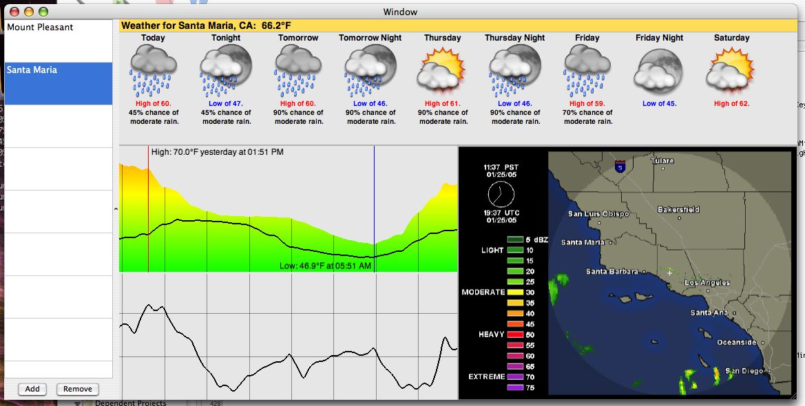

Pre-Seasonality 0.1

While the general layout is the same, I can’t really recognize any part of this window in the current release. Fortunately, it seemed that even though the application was very rough around the edges, the concept was good; it just needed polish, a lot of polish. One thing that I’m sure many users are thankful for though is the color theme switching from a “sunny” yellow to a blue, which looks a whole lot nicer next to other OS X applications.

A lot changed in the 6 weeks after that. I re-worked the forecast to a more compact display with a stacked day/night view, informational text was added in the location table (along with a slicker interface for adding/removing locations), radar images turned into something that I actually generated instead of displaying an image off a website, and graphs actually became something that could be customized a bit. The 1.0 beta was pretty intense, and fortunately Katrina was putting in long hours at the office so I could do the same.

I don’t remember much about March 21st, 2005, but I do remember not sleeping much the night before. It wasn’t that I was cramming all the last minute stuff in, it was more of an anxiety I had. What if it didn’t work on other Macs? What if the web server went offline? What if the licensing didn’t work? What if no one bought it? Luckily, it did work on other Macs, the web server was fine, licensing worked (except for a small detail–I left a serial number in a textbox in the nib file…didn’t take me long to fix that one :-)), and people did buy it. Overall, it was a pretty good release. I posted a preview a few days before release here on my blog. Here’s a screenshot of Seasonality 1.0 in action…
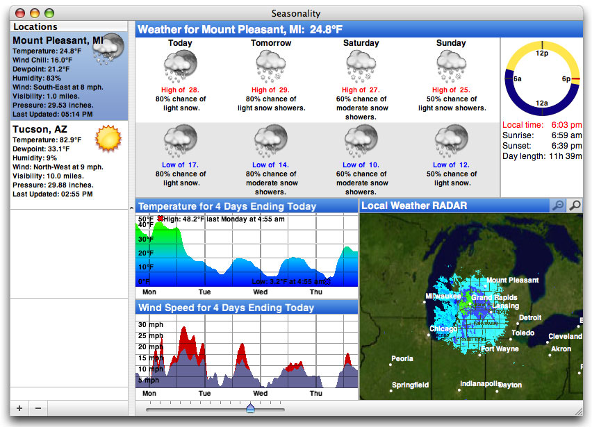

Seasonality 1.0

Naturally, like the 1.0 release of any piece of Mac software, the support and feature requests started pouring in. It was great to hear from everyone who was giving Seasonality a try, and a lot of feature ideas I received at this time have made it into later versions (and some are still on the list of features I’m working on!). At the time there were several ideas I had for future releases, the most notable feature absence was mentioned in the email I sent out for 0.1 above: Seasonality didn’t support international locations. So I went back to cranking out code and 7 months later I emerged with Seasonality 1.1.


Seasonality 1.1

Seasonality 1.1 had a real interactive satellite map…you could drag to navigate all over the world. The forecast changed to it’s current zigzag layout to make it easier to interpret, and the cylindrical wind direction graph was born. I still don’t think there’s any graph like it being used in other weather software, and I’m glad no one has copied the idea yet.

While there have been a lot of new features added since the Seasonality 1.1 release, my programming mode kind of switched at that point. The interface had settled down a bit, and the basic featureset was looking good. I started focusing on evolving the application and molding it into what I ultimately wanted version 1.0 to be. Seasonality 1.2 contained a lot of code cleanup, a ton of bug fixes, and some interface polish.

The polish and cleanup was a big change, but by far the biggest update in Seasonality 1.2 was French language support. I had wanted to support multiple languages for quite some time, but hadn’t a clue how to approach it. After going to WWDC that year and learning about OS X’s localization support, it didn’t look too difficult. Apple’s presentations at WWDC always seem to make things look easier than they are though. 🙂 I heavily underestimated the amount of work required. It took weeks, if not months, of trying to catch all of the different text phrases in the app. Not only did all the strings need a French equivalent, but spacing needed to be changed in cases where the French string was longer than the English one. Then came the help translation, which was an ordeal in and of itself with text encodings and other issues. Fortunately, Ronald and Philippe were dedicated as translators to getting everything done quickly. There were some days I couldn’t keep up with all the changes and updates they were sending over. In the end, I think users really appreciated the change, not only in France, but other French speaking countries such as Canada. Ever since, I’ve been using online translation websites fairly frequently to handle support requests.


Seasonality 1.2

Seasonality 1.3 looked a lot like Seasonality 1.2, with the exception of the new graph handling that allowed more than 2 graphs to be shown at one time. Journalling was the next big thing here. Seasonality finally had a 2nd window! Shortly after Seasonality 1.0 was released, I received a feature request from a gardener who wanted to keep track of and take notes of the current conditions. This was my first hint that Seasonality could be used for anything other than casual weather observation. Since then I’ve received emails from pilots, sailors, home automation specialists among other fields. It’s very satisfying when someone tells me they use Seasonality in a way I haven’t thought of.


Seasonality 1.3

Progress was going great, until August of 2006 when international support broke. Not just “broken” in the respect of being able to fix it with a couple hours of coding, but really broke. In an application dependent on web services, there’s always going to be times when an XML-RPC API will change, or maybe a web site’s layout will foul up your parser a bit. However, in this case Environment Canada pulled their international forecasts entirely. It had taken quite some time to find an international forecast source the first time around; it was even tougher to find a replacement. It took me a week or two just to find a new source, but that source was direct model output data, which is beyond any raw data I had ever worked with. This was the first time I couldn’t just display some weather data, I had to interpret what the model was predicting and programmatically generate forecasts, and then verify that the forecasts were close to what other weather providers were forecasting. It took me over a month just to write code to interpret the data and optimize the web server.

The silver lining to this cloud is the added flexibility I have from this point forward. In Seasonality 1.4 I was able to allow users to add their own custom locations because I was no longer limited to just the locations Environment Canada chose to forecast. A lot of other cool features such as wind forecasts will be coming out of this in the future. When I was finally able to recover and focus on Seasonality 1.4 development, I added moon information, which makes the sundial look a lot cooler, and a ton of bug fixes and code optimizations…


Seasonality 1.4

So where does that leave us? Today I’m happy to announce a new release, Seasonality 1.4.1. There were some remaining bugs in Seasonality 1.4 that just needed to be wrapped up. Especially since development of new features for Seasonality 1.x is nearing the end…

From this point on I’ll be working on Seasonality 2.0. I tagged Seasonality as “weather taken to the next level.” Now it’s time to explore the level after “next.” I’m not ready to announce any new features yet, but I can say the current list is looking pretty hot (no pun intended). I’ve been mulling over a fresh interface design in my head for the past several months–an interface design that will not only improve the display of data that Seasonality currently shows, but also make room for some really cool new feature ideas I have for Seasonality 2.1+ releases… If you’re thinking of buying Seasonality today, don’t hesitate. Seasonality 2.0 is still a ways off, and everyone who purchases Seasonality now will get a free upgrade to Seasonality 2.0.

If you’re still reading at this point, all I can say is “wow,” you have a lot of patience. 🙂 I’d like to send a thanks out to all the Seasonality users and beta testers… The past 2 years have been a blast and I can only hope for the same next year as well.

2007 Warmest Winter on Record

The National Climatic Data Center (NCDC) released their official report on the worldwide climate for February, and for this past winter in general which includes December – February. 2006-2007 has been found to be the record warmest winter in the past 100 years. The report has a lot of information relating to various aspects of climate such as precipitation and snow pack data, but I found one image to be particularly striking: the temperature anomalies for December – February…

So what does this image show exactly? Well, a whole lot of red… Seriously though, to generate this graph the NCDC took worldwide weather observations for December – February for a 30 year period from 1961 to 1990. Then, they took the combined worldwide weather observations for December – February of this year and compared the two. Temperature deviations are shown by different sized/colored dots for a given area.

What’s surprising is not only the large areas over land in the Northern Hemisphere that were 5°C (9°F) or warmer than normal, but also the expanse of warm temperatures worldwide. It’s fairly common for one section of the globe to be warmer or cooler than normal for a few months at a time, but this image is showing warmer than normal temperatures almost universally around the globe.

Some of this can be credited to the recent El Nino event we had this winter. El Nino does play a role, but it most certainly is not responsible for all the warming taking place. CO2 emissions are at an all-time high, and increasing at a faster rate than ever before. If we don’t do something to keep CO2 concentrations in the atmosphere in check, the earth will be a much different place to live 100 years from now.

« Older posts Newer posts »

© 2026 *Coder Blog

Theme by Anders NorenUp ↑